
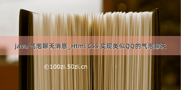
今天自己用 html/css 做了个类似qq的聊天气泡,以下是效果图:
以下说下关键地方的样式设置。然后贴出html和css代码(不多)。
步骤1:布局
消息採用div+float布局,每条消息用一个div标签包裹,里面再放两个div分别用来包裹用户图标和用户消息内容。左側消息,先清除浮动,然后设置 float:left。这样用户图标和消息内容就能够显示在同一行了,当中用户图标在左边,消息内容紧邻着用户图标。
右側消息,相同先清除浮动。然后设置 float:right,这样用户图标和消息显示在同一行了。当中图标在最右边。图标左側是消息。
步骤2:设置圆角矩形
border-radius:7px;
步骤3:三角形箭头
&n
将div的宽度和高度设置为0,设置边框宽度,能够使其表现出一个由四个三角形组成的矩形,每一个三角形的颜色和大小能够通过设置border宽度和颜色设置。
这里将当中三个三角形颜色设置为透明。仅仅留下一个三角形可见。
.triangle{
width: 0px;
height: 0px;
border-width: 15px;
border-style: solid;
border-color: red blue green gold;
}
.triangle{
width: 0px;
height: 0px;
border-width: 15px;
border-style: solid;
border-color: transparent transparent transparent red;
}
关键点4:三角形尾随矩形框
使用相对定位。能够使三角形始终固定在矩形框的边上。
position:relative;
所有代码:
/* bubble style */
.sender{
clear:both;
}
.sender div:nth-of-type(1){
float: left;
}
.sender div:nth-of-type(2){
background-color: aquamarine;
float: left;
margin: 0 20px 10px 15px;
padding: 10px 10px 10px 0px;
border-radius:7px;
}
.receiver div:first-child img,
.sender div:first-child img{
width:50px;
height: 50px;
}
.receiver{
clear:both;
}
.receiver div:nth-child(1){
float: right;
}
.receiver div:nth-of-type(2){
float:right;
background-color: gold;
margin: 0 10px 10px 20px;
padding: 10px 0px 10px 10px;
border-radius:7px;
}
.left_triangle{
height:0px;
width:0px;
border-width:8px;
border-style:solid;
border-color:transparent aquamarine transparent transparent;
position: relative;
left:-16px;
top:3px;
}
.right_triangle{
height:0px;
width:0px;
border-width:8px;
border-style:solid;
border-color:transparent transparent transparent gold;
position: relative;
right:-16px;
top:3px;
}
hello, man!
hello world
以上就是本文的全部内容,希望对大家的学习有所帮助,也希望大家多多支持萬仟网。