
使用纯CSS实现图片轮播效果
首先我们来看一下所实现轮播图的最终效果:
轮播图 效果
接下来为html+css代码部分:
以下为HTML代码部分:
以下为CSS代码部分:
*{
margin:0;
padding:0;
}
.banner{
position:relative;
width:300px;
height:300px;
margin:50px auto;
border:5px solid lightcoral;
overflow:hidden;
}
.banner ul{
width:900px;
padding:0;
transition:all 1s;
}
.banner li{
list-style:none;
width:300px;
height:300px;
float:left;
}
.circle{
position:absolute;
bottom:10px;
left:92px;
}
.circle label{
display:inline-block;
width:20px;
height:20px;
border-radius:50%;
background:lightcoral;
margin:0 10px;
position:relative;
cursor:pointer;
}
.circle label::after{
content:'';
width:30px;
height:30px;
background:lightsalmon;
border-radius:50%;
position:absolute;
top:-5px;
left:-5px;
opacity:0;
}
#put1:checked~.circle label:first-of-type::after,
#put2:checked~.circle label:nth-of-type(2)::after,
#put3:checked~.circle label:nth-of-type(3)::after{
opacity:1;
}
#put1:checked~ul{
margin-left:0;
}
#put2:checked~ul{
margin-left:-300px;
}
#put3:checked~ul{
margin-left:-600px;
}
.left_arrow label{
display:inline-block;
width:24px;
height:44px;
top:50%;
left:0%;
margin-top:-22px;
position: absolute;
}
/* 圆点的put1,put2,put3和箭头的put1,put2,put3是相互联系的,同时受input制约 */
#put1:checked~.left_arrow label:nth-of-type(3),
#put2:checked~.left_arrow label:nth-of-type(1),
#put3:checked~.left_arrow label:nth-of-type(2){
margin-left:20px;
cursor:pointer;
background:url(../img/ban_prev.png) no-repeat center center;
}
.right_arrow label{
display:inline-block;
width:24px;
height:44px;
top:50%;
right:0%;
margin-top:-22px;
position: absolute;
}
#put1:checked~.right_arrow label:nth-of-type(2),
#put2:checked~.right_arrow label:nth-of-type(3),
#put3:checked~.right_arrow label:nth-of-type(1){
margin-right:20px;
cursor:pointer;
background:url(../img/ban_next.png) no-repeat center center;
}
以下为我所使用的图片素材文件,有需要可自取(均为png格式):
箭头图片素材1(透明)
箭头图片素材2(透明)
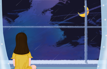
first.png
second.png
third.png
keep learning
转载请注明来源